
A deep dive into designing an enterprise-level app store — filled with challenges, insights, user research, and exciting discoveries that transformed how sales teams work.
It all began when my boss mentioned the app store project and told me my only responsibility was to "just be on calls and listen." Wait… just listen and learn? Who even gets paid for that? 😊 Anyway, the story had just begun.
After a few calls, I noticed no one was taking ownership of the UX research. My love for UX wouldn't let me stay quiet, so I jumped in and said, "I'll do it!" — and that's where the real journey started.
I began with UX research to uncover user needs and pain points. After mapping user flows, I created wireframes and tested them early to gather feedback. These insights shaped the final visual designs, which were again tested to ensure a smooth, user-friendly experience.
Enterprise sales teams struggled with scattered apps and prototypes across multiple platforms, making it difficult to efficiently access and demonstrate solutions to clients. This fragmentation was impacting sales productivity and client presentations.
A one-stop store that:
Business goals and requirements were clearly set, but I needed to identify the actual users. My first task was to understand the needs of our users so that we could design an app store experience that worked for everyone — from developers to salespeople.
I conducted stakeholder interviews to identify user groups and performed 7 user interviews with sales team leaders across different regions.
This segmentation helped me prioritize features and design flows — focusing first on the needs of salespersons while ensuring developers and admins also have a smooth experience.
Quick access to demo-ready content
Supporting materials like case studies and testimonials
Calendar integration and client tracking
Analytics on demo success rates
Based on research insights, I created detailed personas representing our key user groups.

User Personas: Client Engagement Specialist (Sunny), Head of BPO (Mahesh), and Head of BPO (Ram)
"The Professional Who Cannot Afford to Waste Time"
Time for creating empathy maps based on user persona to understand what users say, think, do, and feel.

Empathy Maps: Understanding user thoughts, feelings, pain points, and behaviors
The core journey centers around demo scheduling as the primary user goal:
Search and filter apps by client needs
Review app details, case studies, testimonials
Book demo with calendar integration
Access supporting materials during client demo
Collect feedback and track outcomes
Based on user needs and business impact:
The most critical user flow revolves around scheduling a demo for the client — the heart of the entire experience. Users search and discover the right app, add it to their demo schedule, explore app details, and finally showcase it seamlessly to the client.

User Flow Diagram: Search, Demo Scheduling, Dashboard, and Feedback Collection

App Detail User Flow: Login → Homepage → App Detail → Demo Done → Feedback
Now, I moved on to creating low-fidelity wireframes. These wireframes helped visualize the structure, layout, and navigation of the Appstore without getting distracted by colors or UI details.

Wireframes: Complete user journey from Landing page to Demo completion with feedback
Once the wireframes were created, they were tested with 5 sales team members (primary users) to validate whether the proposed design met their expectations and solved their pain points.

Usability Testing Report: Participant feedback analysis with Common Needs, Pain Points, and Opportunities

Wireframe Updated for Landing page, See all page, App detail, Video playing, Feedback pages
Users can search for apps and drag them into the New Demo section. After adding the client name and date, the demo is saved and moved to the Scheduled Demo list. Once completed, it shifts to the Completed Demo section, where users are prompted to provide feedback.
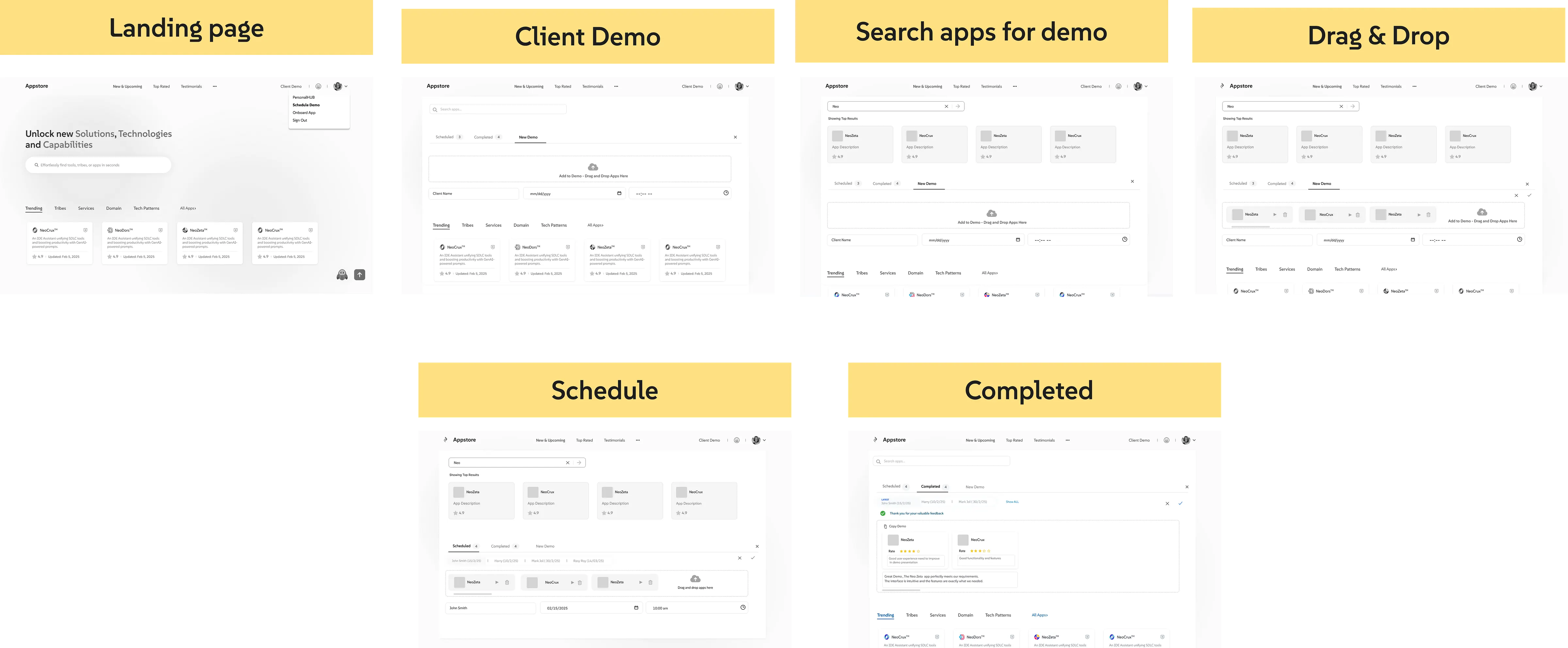
Scheduling Demo for Sales Persona: Landing Page → Client Demo → Search → Drag & Drop → Schedule → Completed
Top analytics, search bar, categorized apps
Advanced filtering with AI suggestions
Expandable sections with case studies
Drag & drop with calendar integration

High-Fidelity Visual Designs: Landing Page, Search Page, Filtering, Schedule Demo, See All Apps, App Detail Page
And that's a wrap on this UX adventure!
What started as a simple idea — "let's make an internal app store" — turned into a full-blown journey of researching, testing, learning, and redesigning (with a few coffee-fueled late nights).
The final result? An app store that's easy to use, loves salespeople back, and actually helps them find apps, schedule demos, and shine in front of clients.
Of course, UX is never "done-done." There's still more fun stuff to add — a smarter Personal Hub, cool testimonials, reward badges, and analytics. But hey, that's what future phases are for! 😄
When you listen to users, test like crazy, and sprinkle a bit of UX magic — the results are always worth it! 🎉